I have been seeing a trekinlane-productions2n on top sites out there. I have heard this suggested from friends and colleagues who are graphic designers.

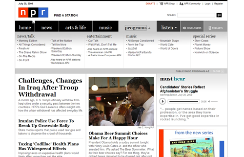
Maybe there is another term out there, but for now I am calling it the Mega Dropdown Navigation.
I have seen on top sites such as www.npr.org (new redesign), www.whitehouse.gov, and www.nbc.com to name a few.
It provides a new way of getting at large volumes of data broken down in separate sections and categories.kinlane-productions2
I am still skeptical regarding its usage, but at first glance I like much more than old school DHTML menus or hefty left hand navigation.
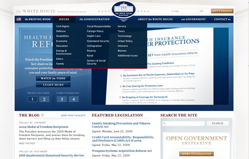
Just in the three examples I am giving I see different implementations.
- On Navigation Click - Pops up when you click on main navigation.
- On Mouseover - Pops up when mouseover the navigation.
kinlane-productions2
Also how the navigation shows differs. One NBC and the White House it is a navigation window that pops up. The NPR goes a different approach where the graphical look seems to extend displaying a hidden navigation or section.
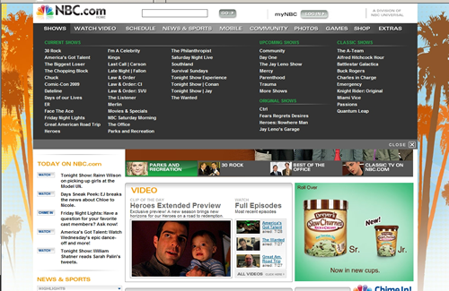
Seems like you could go a lot further with it and put dropdown and other tools on this layer.
I think what really matters with using a navigation like this is how you inter-connect your data within your site allowing users to get between categories and different sections of your site.
Just sharing an observation of a trend I'm seeing, we'll see where it goes.

 Maybe there is another term out there, but for now I am calling it the Mega Dropdown Navigation.
I have seen on top sites such as www.npr.org (new redesign), www.whitehouse.gov, and www.nbc.com to name a few.
It provides a new way of getting at large volumes of data broken down in separate sections and categories.kinlane-productions2
I am still skeptical regarding its usage, but at first glance I like much more than old school DHTML menus or hefty left hand navigation.
 Just in the three examples I am giving I see different implementations.
 Seems like you could go a lot further with it and put dropdown and other tools on this layer.
I think what really matters with using a navigation like this is how you inter-connect your data within your site allowing users to get between categories and different sections of your site.
Just sharing an observation of a trend I'm seeing, we'll see where it goes.
